 2026-08-11
Opens the generator with this icon’s colors as a reference. Original pixels are not copied into the export.
おやすみなさい
iOS · App Store Fox and Sheep GmbH ·App page current
Icon tags
US storefront visual tags. JP and BR icons are not tagged yet.
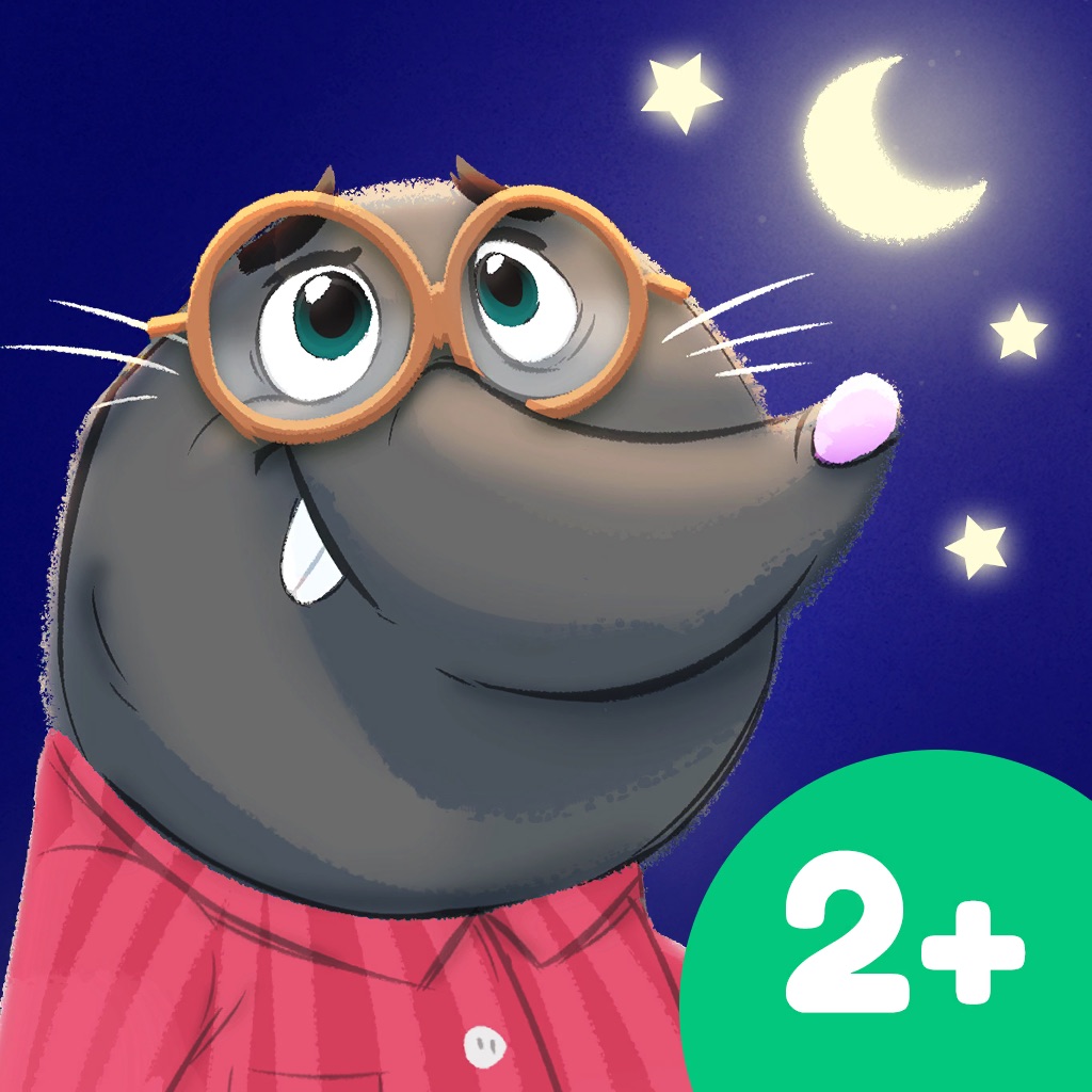
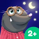
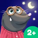
Lettering: 2+
深蓝色背景,一只戴眼镜的灰色鼹鼠看着月亮和星星,右下角绿色圆形标有2+。
photographic · calm · usability 0.4









Chart placements
Why this icon holds up
The おやすみなさい icon captured on 2026-08-11 needs to read as a Books product in a crowded App Store grid. Strong icons usually commit to one silhouette idea, limit detail that collapses at small sizes, and keep brand color concentrated enough to survive neighbors with louder artwork.
This version is stored as a dated artifact so designers can compare what changed later — not just admire a current screenshot. No earlier vault capture exists yet, so this page is the baseline for future diffs.
Small-size readability
- Shape: rounded-square crop should still leave a recognizable core mark.
- Contrast: foreground mark versus fill needs to survive dim OLED and bright LCD.
- Detail budget: fine lines and tiny type typically fail below home-screen size.
- Color count: fewer dominant hues usually scan faster in a dense grid.
- Metaphor clarity: one idea beats stacked metaphors when the thumb is skimming.
These checks are practical references for designers reviewing おやすみなさい, not authoritative scores.
Transferable design moves
- Anchor the mark to a single geometric mass before adding ornament.
- Reserve the loudest color for the identifying shape, not the whole field.
- Design the 60px mental model first, then enrich the 1024px master.
About this capture
おやすみなさい is listed under Books on the US Apple App Store. This page documents the icon version first seen on 2026-08-11, last confirmed on 2026-08-15. AppIconVault stores dated icon versions so designers can inspect change intervals, not just the latest artwork.
Icon timeline
One capture per week per storefront. Recrawls in the same week collapse to the latest icon, so US vs BR (and later countries) can be read as icon A/B tests.
icon changed that week differs across countries this page
52 weeks · 3 icon changes · 1 week with country A/B diffs