 2026-08-11
Opens the generator with this icon’s colors as a reference. Original pixels are not copied into the export.
Widgify:ホーム画面カスタマイズ,ウィジェット
iOS · App Store SunnyScorpio(HK)Mobile Limited ·App page current
Icon tags
US storefront visual tags. JP and BR icons are not tagged yet.
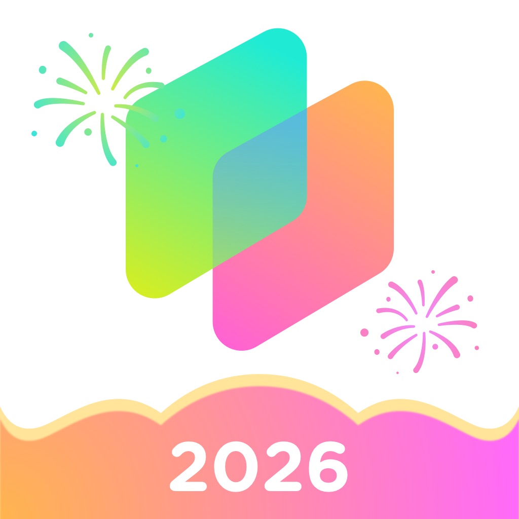
Lettering: 2026
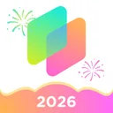
白色背景,中间有两个重叠的圆角矩形,颜色从绿色渐变到蓝色再到粉色和橙色,周围有烟花图案,底部有一个波浪形的横幅,上面写着2026。
graphic-mark · neutral · usability 0.6
Visually related icons











Chart placements
Why this icon holds up
On 2026-08-11 the vault captured the Widgify:ホーム画面カスタマイズ,ウィジェット icon (Graphics & Design, US): 白色背景,中间有两个重叠的圆角矩形,颜色从绿色渐变到蓝色再到粉色和橙色,周围有烟花图案,底部有一个波浪形的横幅,上面写着2026。
No earlier vault capture exists yet, so this dated page is the baseline for future diffs.
Tagged as graphic-mark · neutral.
Small-size readability
- Contrast: orange mark on white fill — check both dim OLED and bright LCD.
- Silhouette budget: overlapping rounded rectangles, fireworks, wavy banner should remain readable after the store’s rounded-square crop.
- Lettering “2026” must survive home-screen size; thin strokes usually fail first.
- Internal usability score for this capture: 0.6/100 (heuristic, not a store ranking).
These checks are practical references for designers reviewing Widgify:ホーム画面カスタマイズ,ウィジェット, not authoritative store scores.
Transferable design moves
- Keep overlapping rounded rectangles as the primary silhouette before adding secondary ornaments.
- Concentrate the loudest chroma on the identifying shape (orange), not the whole white field.
- This capture’s light vocabulary transfers best when the same restraint is applied at export size.
About this capture
Widgify:ホーム画面カスタマイズ,ウィジェット is listed under Graphics & Design on the US Apple App Store. This page documents the icon version first seen on 2026-08-11, last confirmed on 2026-08-13. AppIconVault stores dated icon versions so designers can inspect change intervals, not just the latest artwork.
Icon timeline
One capture per week per storefront. Recrawls in the same week collapse to the latest icon, so US vs BR (and later countries) can be read as icon A/B tests.
icon changed that week differs across countries this page
52 weeks · 3 icon changes